ControlTemplates in XAML
XAML has this great concept of look-less controls. When we see a normal Win32 control like say a checkbox, we always assume that it will be a square box along with some text written to the left of it. Taking an example from our old friend WordPad, we would always expect a checkbox to look like
Pretty boring, if you would ask a kid (or even a teenager!). Even though it makes the control much more usable (which is a very important thing BTW), it doesn’t look cool. So how does WPF help us here?
For starters, when you define a control, WPF doesn’t force to you to define the look of the control along with the functionality. Here comes the concept of a look-less control; a control whose behaviour is defined but whose look is not defined. For instance, we might define the behavior of the check box (it has a bool or a bool? property called IsChecked, it has a check mark to the left of the content, etc… 😉 but leave it to the author to define the look for it. So we might have something like
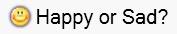 |
Checked Checkbox |
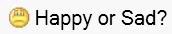 |
Unchecked Checkbox |
How to go about doing this? This is all done by redefining the ControlTemplate for the checkbox. ControlTemplate is basically what it says, it is a Template for the Control and decides how the control will look like. To achieve such a look we define the Style of the Checkbox as
<Style x:Key="{x:Type CheckBox}" TargetType="{x:Type CheckBox}">
  <Setter Property="SnapsToDevicePixels" Value="true"/>
  <Setter Property="OverridesDefaultStyle" Value="true"/>
  <Setter Property="Template">
    <Setter.Value>
      <ControlTemplate TargetType="{x:Type CheckBox}">
        <WrapPanel Orientation="Horizontal">
          <Border x:Name="Border"
          CornerRadius="0” >
            <Image Name="CheckMark"
              Height="{Binding ElementName=MyContent, Path=ActualHeight}" Source="happy.gif">
              <Image.BitmapEffect>
                <OuterGlowBitmapEffect GlowColor="Blue" GlowSize="2” Noise=".1” Opacity="0.8"/>
              </Image.BitmapEffect>
            </Image>
          </Border>
          <ContentPresenter Margin="4,0,0,0" Name="MyContent"
          VerticalAlignment="Center"
          HorizontalAlignment="Left"
          RecognizesAccessKey="True"/>
        </WrapPanel>
        <ControlTemplate.Triggers>
          <Trigger Property="IsChecked" Value="{x:Null}">
            <Setter TargetName="CheckMark" Property="Source" Value="unsure.gif" />
            <Setter Property="BitmapEffect" TargetName="CheckMark">
              <Setter.Value>
                <OuterGlowBitmapEffect GlowColor="Black" GlowSize="2" Noise=".1"
            Opacity="0.8" />
              </Setter.Value>
            </Setter>
          </Trigger>
          <Trigger Property="IsChecked" Value="false">
            <Setter TargetName="CheckMark" Property="Source" Value="sad.gif" />
            <Setter Property="BitmapEffect" TargetName="CheckMark" Value="{x:Null}"/>
          </Trigger>
          <Trigger Property="IsMouseOver" Value="true">
            <Setter Property="BitmapEffect" TargetName="CheckMark">
              <Setter.Value>
                <OuterGlowBitmapEffect GlowColor="Red" GlowSize="2" Noise=".1"
            Opacity="0.8" />
              </Setter.Value>
            </Setter>
          </Trigger>
          <Trigger Property="IsPressed" Value="true">
            <Setter Property="BitmapEffect" TargetName="CheckMark">
              <Setter.Value>
                <OuterGlowBitmapEffect GlowColor="Yellow" GlowSize="2" Noise=".1"
            Opacity="0.8" />
              </Setter.Value>
            </Setter>
          </Trigger>
          <Trigger Property="IsEnabled" Value="false">
            <Setter TargetName="Border" Property="Background" Value="{StaticResource DisabledBackgroundBrush}" />
            <Setter TargetName="Border" Property="BorderBrush" Value="{StaticResource DisabledBorderBrush}" />
            <Setter Property="Foreground" Value="{StaticResource DisabledForegroundBrush}"/>
          </Trigger>
        </ControlTemplate.Triggers>
      </ControlTemplate>
    </Setter.Value>
  </Setter>
</Style>
Let us dissect this monster to see how it works 🙂
The first line
<Style x:Key="{x:Type CheckBox}" TargetType="{x:Type CheckBox}">means that this is a Style being defined for Type CheckBox in the namespace referred to by x which is http://schemas.microsoft.com/winfx/2006/xaml in my case.
Moving on, the core part of the Style is in defining the ControlTemplarte.
<ControlTemplate TargetType="{x:Type CheckBox}">Note that I could have defined the ControlTemplate for the CheckBox using CheckBox.ControlTemplate but have chosen to implement it using a Style as it is quite common to do so.
It is in this ControlTemplate that I define the look of the CheckBox. Here I say that it should be a WrapPanel which should contain a Border which has an Image and a ContentPresenter in it. You can read more about the ContentPresenter in MSDN, it is just a UIElement which can contain and display any other object. The Image has a binding to the Height of the ContentPresenter so that it resizes automatically to the Height of the content, else you might have a case when you have text with FontSize 36 points but you checkmark is just 10 pixels high. That’s it! That’s the definition of our customized CheckBox; could it be any easier?
I added some Triggers to change the Image in the CheckBox depending on its state. I have added an image when IsChecked is null to account for a Tri State CheckBox. I also added some BitmapEffects for a Glow (just to make it more pretty!)
Go through the code, it isn’t very hard to understand or comprehend. Now whenever you wish your CheckBox to use this style, simply use it as
<CheckBox Margin="8” Style="myCheckBoxStyle">
  <TextBlock FontSize="20">Happy or Sad?</TextBlock>
</CheckBox>
If you find this article useful, do comment and let me know